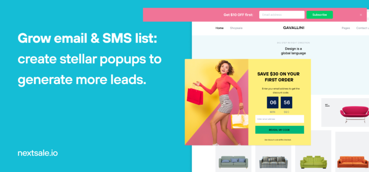
Growing e-mail and SMS leads is crucial to monetize your visitors and market your business.
There are many ways to do that.
But, it needs careful strategy not to:
- Hurt user experience
- Invade privacy
Decades ago it was OK to buy phone numbers and e-mail addresses. It turned out that it is illegal by all means to invade privacy.
Why spend money on buying leads when you can build yourself for free? (Roll Safe tapping his head meme)
You can capture phone and email addresses with on-site messages and can generate leads with email and SMS marketing automation without hurting user experience or invading privacy.
On site widgets not only help you grow your subscriber base to effectively market your consumers, but also help you highlight relevant offers, products, and sales opportunities and recapture your visitors attention before they leave your site.
Before moving to how to use on-site widgets to grow subscriber lists, let’s start from scratch.
What is lead generation?
In the eCommerce sales context, lead or prospect refers to contact with a potential customer. Lead generation is the initiation of a customer who shows interest in a product or service a business provides.
Depending on a business’s purpose, the lead generation process can be used for promotions or newsletter list building.
The main purpose of lead generation in eCommerce marketing is to build a potential customer list for sales.
Business leads fall into three categories:
- Opt-ins are people that share their contact information to receive email communications.
- Marketing Qualified Lead (MQL) is someone who is more likely to become a customer. Leads are qualified when they have shared their contact information.
- Sales qualified Lead (SQL) is someone who has shown an interest in your product or service. Sales leads are researched by sales representatives, and ready to move to the next stage – the sales process.
SMS VS e-mail marketing
SMS Marketing is one of the Mobile marketing techniques that refers to sending promotional or transactional text messages to people who have consented to receive these messages from a brand. The content of these kinds of campaigns most of the time includes promotional offers, updates, or alerts.
E-mail marketing refers to the act of sending promotional messages to, mostly, a group of prospects or customers. The aim behind an email campaign within marketing efforts is to promote a business’s products and services, as well as build meaningful relationships with your customers to incentivize customer loyalty.
Marketers find SMS marketing way more effective than email marketing. There are some benefits to using SMS marketing.
- 75% of consumers prefer receiving an offer via SMS.
- SMS open rates are as high as 98%, whereas it’s 20% for emails.
- Consumers keep their mobile phones on hand, this makes it easy to communicate with them with instant messaging.
All these benefits don’t mean that the era of email marketing is over. The usage of emails is still increasing. In 2019, the number of global e-mail users amounted to 3.9 billion and it’s expected to grow to 4.48 billion users by 2024.
Plus, as in SMS marketing, email marketing also allows you to segment, target/retarget, and market your leads, and reach a large number of people all at the same time.
What is a pop up?
Yes, no joke in this question, people still ask this question.
A popup is a type of window that appears on the screen when you are browsing online. The window is usually shown in the form of a small, floating box that covers some or all of your screen. It may be just an ad or it can include images, videos, text and links to other websites.
Pop ups are usually displayed as soon as you visit the webpage. They can also show up when you’re scrolling down, or about to exit the webpage.
Pop ups help to make a website more interesting and engaging. They are typically used for advertisements, entertainment, and offers, but they are most commonly used to capture email addresses and phone numbers.
Modal pop ups or lightbox? What is the difference?
A modal window is a graphical control element that is used for information purposes where the user’s immediate attention is required. They occupy most or all of the screen space, and often require some kind of interaction (such as clicking) before continuing with what users were doing before it appeared.
Modal windows are a type of popup window which require user action to go past them and access the website’s content. They are used for a wide range of purposes, from signing up or logging in, to submitting a form or carrying out any other interactive tasks.
Lightboxes are used to display images and videos with a modal popup. Usually, they give the user an opportunity to view and click on the content in a window that appears on top of the parent window. They’re very common and used for various purposes such as display ads, and/or promotional offers on webpages.
What are the types of popups?
The most common type of popups are based on their intentions:
- Cart abandonment popups
- Lead capture popups (email & SMS number subscription forms)
- Announcement popups
- Discount popups
- Navigation popups
- Welcome popups
- Exit-intent popups
Cart abandonment popups are used to remind visitors-customers that, they have some items added to their shopping baskets, and haven’t completed the checkout.
Phone number & email capture popups are used to grab some leads for SMS and email marketing activities.
Announcement promotions popups are simply popups that displays news about products, services, or features.
Discounts popups are used to show coupon codes or promo offers to increase sales as well as subscription related conversions.
Navigation popups are used to invite users to another page.
Welcome popups, as obvious from its name are used to “say hi” to new coming visitors. Usually, there are some coupon codes placed on the popup to increase engagement and convert first-coming visitors into customers.
Exit-intent popups appear when users are about to leave the web pages.
- Learn more about exit-intent technology triggered popups.
How to create email & phone number capture pop ups with Nextsale?
It takes only 3 clicks to run an email & phone number subscription campaign with Nextsale.
And, it’s completely free. Not to mention, no credit card required.
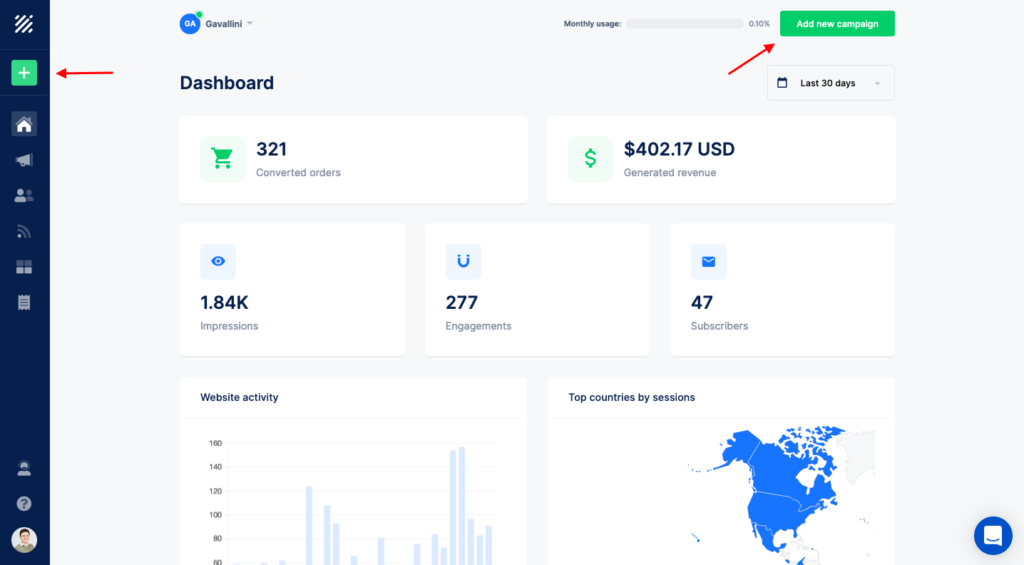
1. Go to the Dashboard
2. Click on the “Add new campaign” or plus (➕) icon from the left toolbar.
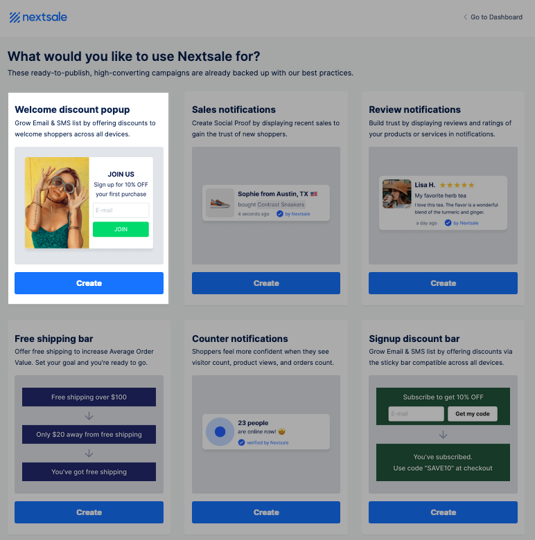
3. Click on the “Create” button of the pre-built “Welcome discount popup” campaign.
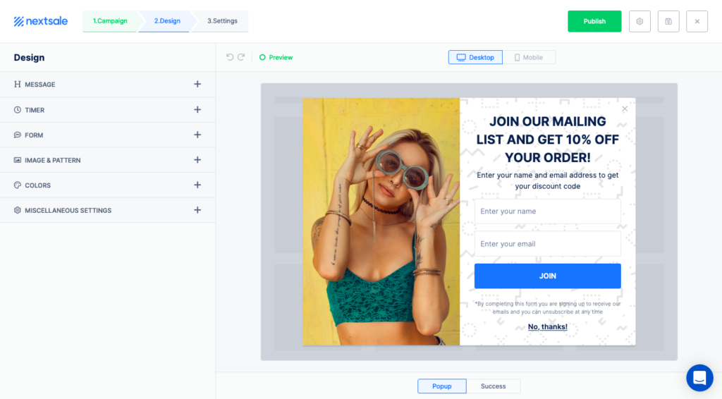
4. Once you pushed the Create button, you’ll be directed to the builder where you can customize the Design and Miscellaneous settings, or publish the campaign right away by clicking on the green “Publish” button.
Before publishing the campaign, you should add the promo code that you generated apart from Nextsale.
5. To add the promo code, click on the “Success” button.
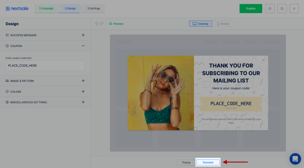
6. On the left side, place the code that you generated before to the “Coupon” section:
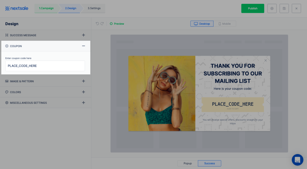
Once you placed the coupon code, the campaign is ready to be published.
7. Click on the green “Publish” button.
DONE! That much simple.
- Check the article to learn how to customize lead capture campaigns.
Now…
How to create email & SMS capture popups that convert?
Creating effective e-mail & SMS capture campaigns require some adjustments. Here are key consideration while creating stellar lead generation campaigns:
- Content & message & design
- Campaign triggers – intents
- On-page personalization & conditions
- Time delays & frequency settings
Content & Message & Design
Content of on-site messages is the base upon which you promote your offers, deals, and calls and it plays a huge role in winning or losing potential customers; so, it’s essential to give it the attention it deserves.
Here is what a content of email & phone number capture campaigns should include:
- Valuable incentive
- A clear call to action
- Eye-catching design
- Available close button
- A sense of FOMO
Offer a valuable incentive
Give valuable incentive that’ll interest your audience. In lead generation campaigns you should give something in return for calling them to take an action – submit their contact info. For example, if you’re a Shopify store, offer discounts, or if you’re a blogger, offer your valuable content to your visitors.
You encourage your visitors to sign up by making them feel that they are better off with your offers: they receive more than they give.
Deliver value:
- Make sure there’s something in it for them (and never, ever, spam!).
- Offer a special knowledge base only for sign-ups.
- Give promo offers like discounts, free shipping, hot deals, etc.
Consider the followings:
- Get creative and create your own content. You can play around with the message and include non-offensive jokes and puns.
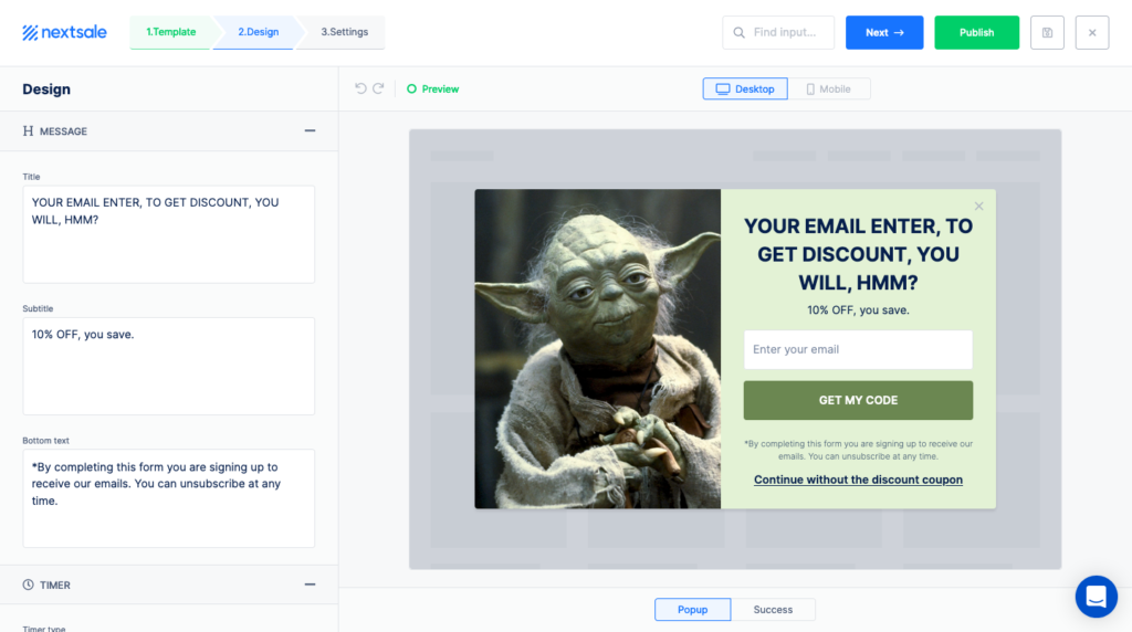
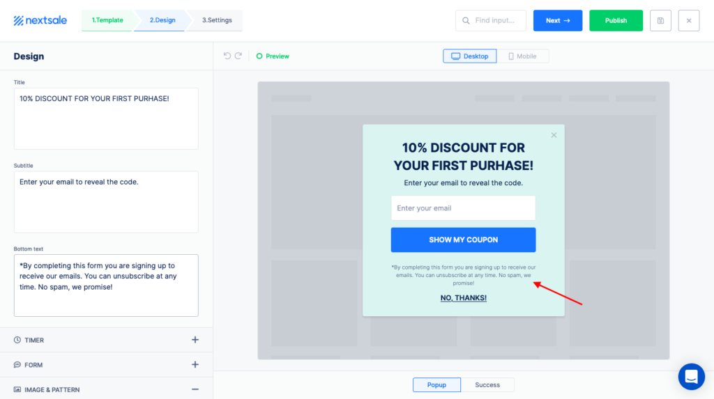
- Input microcopy text near the CTA button to win fear and doubts of spam.
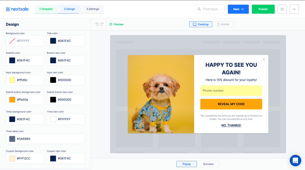
- Get personal – segment your audience for the first time and returning visitors.
Make sure that the content of your popup is unique to new visitors and have a separate popup for returning visitors. Like, for new visitors you can display 10% for their first purchase while for returning visitors you can use upsells or new arrivals, or offer products that are similar with the one they checked or bought.
In the example below, the popup is displayed to the returning visitors with a simple welcome back message.
- The most valuable content is making your audience smarter: offer content that’ll add knowledge to them.
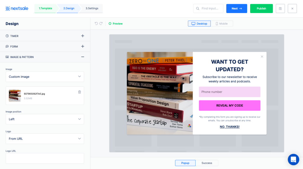
Create a clear call to action
Here, you let your visitors know what they are submitting or signing up. Be transparent with your audience about how much you’ll send SMS or emails, or what your content will be. And tell your customers that you respect their privacy; indicate that there’ll be no spam emails in the call to action.
Plus, depending on the popup app you use, let them know when the promised offer will be delivered. The cases may include:
- Discount to be applied in the checkout process automatically
- Discount codes to be sent to as email or SMS
- Discount codes to be revealed once the contact information is submitted
- Newsletter to be sent in the certain period of time
Use eye-catching design
Your on-site widgets should grab attention as well; here comes the visuals. Use the following tips while creating your lead generation campaigns:
- Match the popup colors to your site theme
- Choose contrasting colors for the CTA button
- Input an image that’ll catch the attention of your visitors. Visuals don’t have to be related to what your business does, they can be completely different topics.
Make the close button available
By making the close button available, you show the visitors that they have an option to close the popup – so you give them freedom of choice.
Also, a discouraging “no” option makes visitors think twice (Semrush). When you have a close button, visitors are more likely to accept your offers and take action.
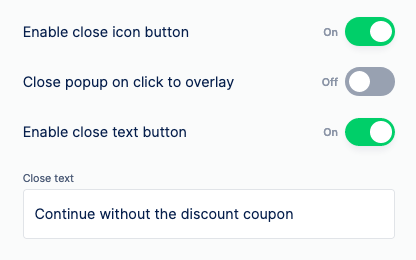
Create a sense of FOMO
Let your visitors know that you offer discounts and send the latest news only via email or SMS. By doing so, your visitors will fear the sense of missing your offers out. You also give the message that your content and discounts are valuable – your offers are not available to all people.
Also, make your discounts limited in number and time. You can include a cart timer or countdown to create FOMO. By doing so, you create a sense of urgency for your visitors to subscribe to the newsletter before it’s too late.
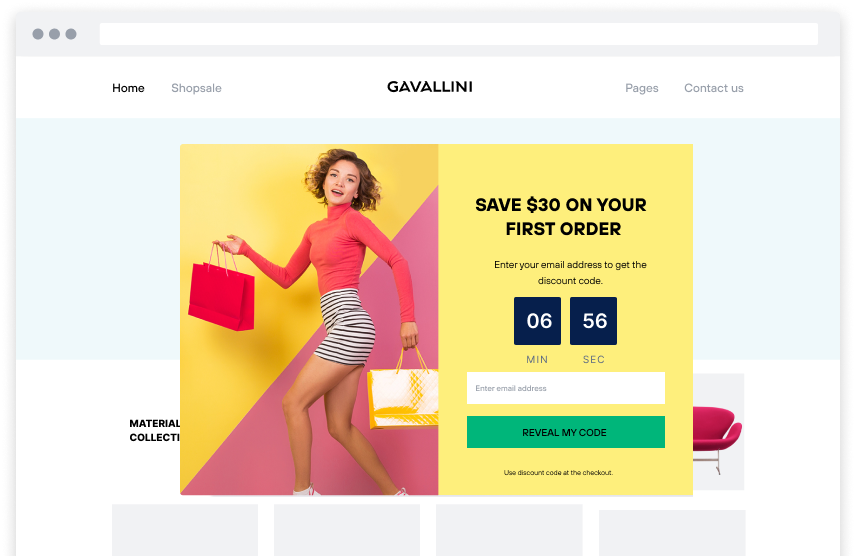
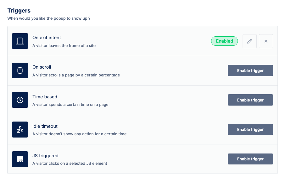
Display widgets ruled by triggers based on your visitors’ on-site behaviors
On-page triggers are the rules of the campaigns which determine when your on-site messages should appear.
Types of trigger rules include:
- Exit-intent
- Page scroll or percentage
- Time-based
- Idle timeout
- JavaScript events
Show on-site messages when visitors are about to leave
Exit-intent is one of the most powerful campaign triggers.
On-exit intent technology triggers widgets to appear when a user’s cursor is moving out of the upper page boundary; and, it’s done by tracking mouse movements. On-exit technique is used to retain visitors from abandoning a website by appearing to offer special discounts as the visitor is about to leave your site.
You can use exit intent triggers depending on the campaign purpose.
Show on-site messages when visitors scrolled a certain percentage of a page
On-scroll or page percentage technique is used to display popup after a visitor has scrolled down a certain percentage or section of a page. With this technique, you allow visitors to understand what your content is, and after that, you display your popups.
Show on-site messages when visitors have spent a certain time on your page
Another type of on-page widget triggers is time-based. Like on-scroll technique, you determine when to show widgets after a certain time that a visitor spends on your page.
Show on-site messages when a visitor doesn’t show any action
Likewise, idle timeout triggers make widgets appear when a visitor doesn’t show any action for a certain time. You set time, and after that determined time, when a visitor doesn’t move the mouse, the widget appears. When visitors have been inactive for a determined time, the popup will appear.
Show on-site messages when visitor click on a JS element
JS triggered widgets appear when a visitor clicks on a selected JS element. This technique is used to let your visitors focus on the site content, and widgets to appear only with visitors’ consent – here with their clicks.
By playing around with the triggers, you customize and be more flexible about the widgets, with already knowing your visitors/customers.
On page personalization and campaign conditions
Campaign conditions are great help when you want to target your specific audience. While on page targeting triggers help you determine when to show the widgets, campaign conditions help you define who should see your on-site messages. On-page targeting rules are a great help to personalize your on-site messages.
You can decide who should see your on-site messages based on your visitors’:
- Geolocation
- Network IP
- Visiting pages
- Sessions
- Language
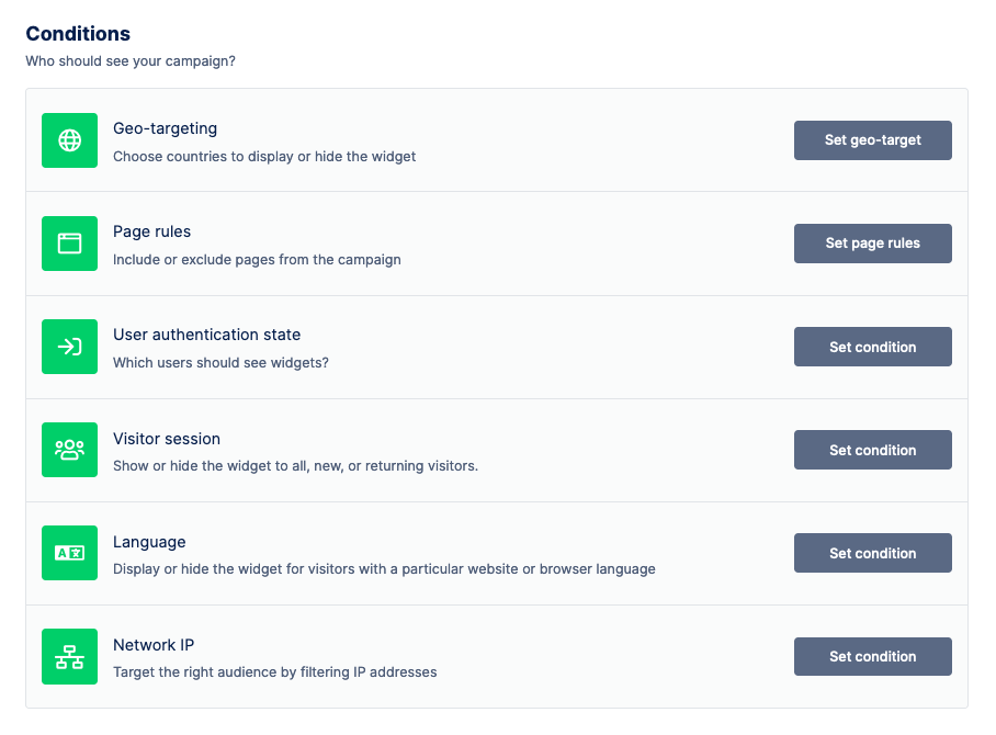
Target visitors based on their country location
Country targeting lets you include or exclude certain countries from the campaign to personalize the widgets for your visitors.
Use this case: you’re selling only certain countries: include countries for visitors only to those countries to see your offers.
Display you campaign to visitors only with specific network IPs
Network IP location condition is used for more specifically funneling the widget audience. By using this feature, you can funnel your campaign audience by including or excluding only certain IP addresses.
Show your widgets only on certain pages
With the page rules condition, you can include or exclude certain pages from the campaign. This feature helps you limit the number of pages for widgets to appear.
Consider this: signup and email phone capture campaigns best works on the landing page, shop and blog pages.
Display your campaign to new, returning, or all visitors
With the visitor session condition, you determine which audience to show the campaign. Here, you can show the separate content to your first time or returning visitors.
Use these cases: welcome your first-time visitors and let them know your offers are special for them.
Or, show email & phone number capture widgets to only the returning visitors since with the visitor sessions count you can say if they’re interested in your product.
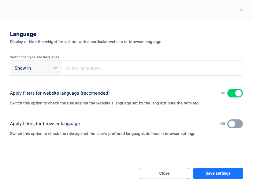
Let visitors with a certain browser or lang attribute of the HTML tag see your messages.
Language condition is another powerful tool to personalize your widgets.
You can include or exclude certain languages from your campaigns. By doing this, you show or hide the widgets to only a particular website or browser language.
You can either set the language condition to the browsers, or website’s lang attribute.
Displaying the popup right after a visitor lands on your page is one of the biggest mistakes site moderators make. They lower time delays between popups, so even if a user closes the first popup, the next ones pop up right away. Even if you offer discounts and valuable content, and display it with short delays, bad news – you’re annoying.
- Read the article about how to avoid creating annoying promo popups.
Don’t be that salesperson who follows you as soon as you enter a market.
Let your visitors take a breath – first get to see your content and engage with your website. After a certain time, you are free to display a popup and offer a discount to motivate them to take action.
Email & phone number capture Popup ideas in 2021
Summing up the points mentioned above, let’s review some popup examples and get inspired to create your own popups!
#1 Site: https://pascaleandemile.com/
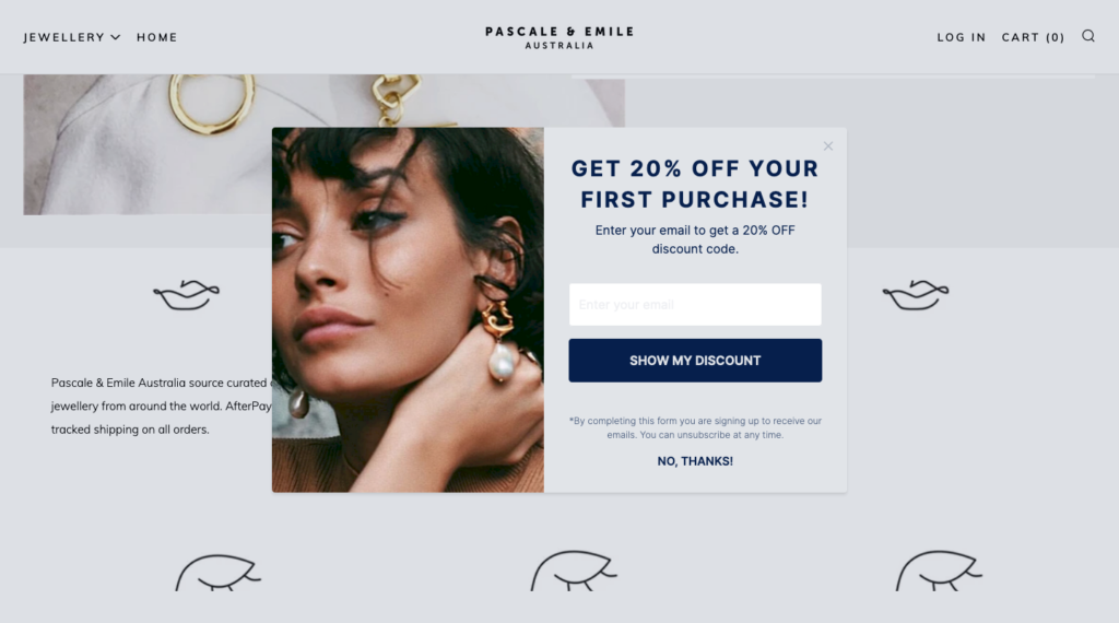
Why we loved it?
- Simple and aesthetic design. The colors of the popup match with the website design.
- Clear content. Special discount for first-time visitors.
- Microtext and a closing button are displayed.
- Campaign trigger is showing the popup only once to the first-time visitors.
#2 Site: https://themeadowshop.ca/
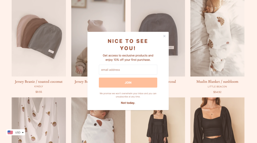
Why we loved it?
- No photo, just colors matching the theme.
- Warming welcome message for first-time visitors.
- Microtext and the closing button are available to let visitors think twice.
#3 Site: https://rambleandrowe.com/
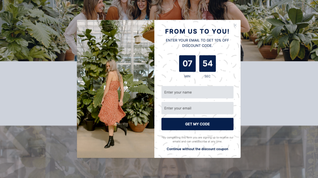
Why we loved it?
- The combination of the background patterns, image, and button colors match with the store design.
- The popup design gives the overall idea of the store – ramble clothing.
- Cart timer indicating the limited time to reveal the discount code.
- A clear close button and text as an option to close the popup.
- Liked the popup? Try this popup FOR FREE here.
#4 Site: https://www.taylorstitch.com/
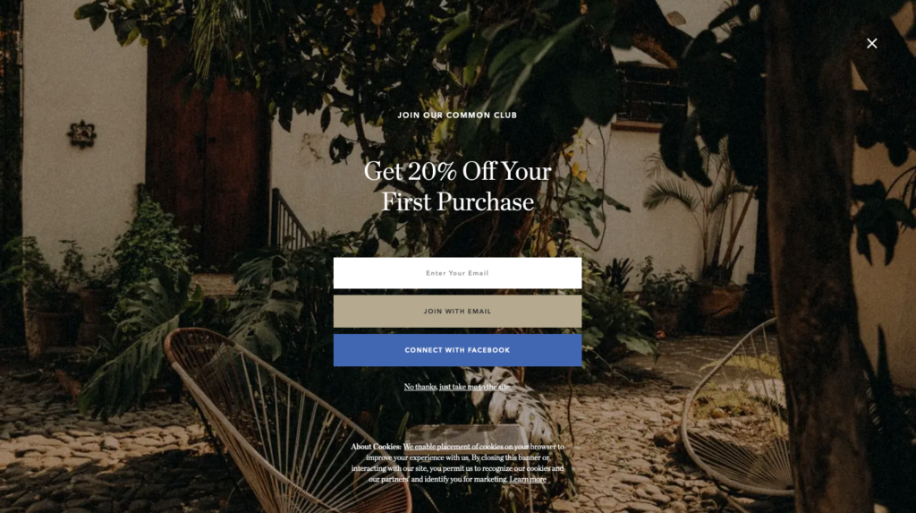
Why we loved it?
- Short text straight to the point, indicating the discount code for the first purchases.
- The popup covers the full screen, catching the full attention of the visitors to the offer directly.
- Popup’s background photo matches with the product photos.
- Big close button on the top right of the page and text.
#5 Site: https://wpstandard.com/
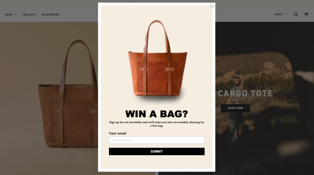
Why we loved it?
- Simple image and design.
- Specifying the offer: “Win a bag?”
- Letting the visitors feel themselves in a competition, creating competitive ambiance.
#6 Site: https://www.nickmayerart.com/
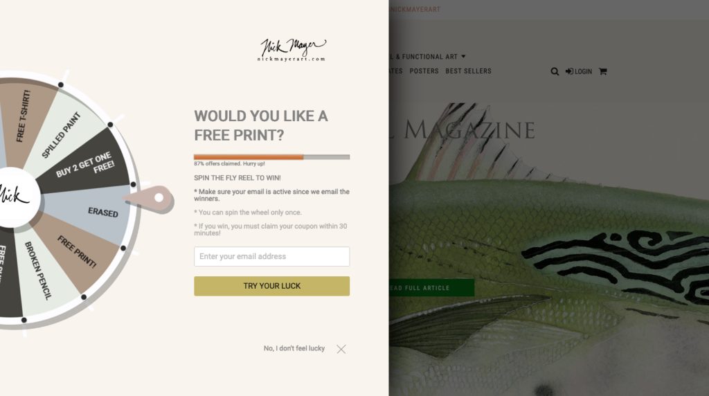
Why we love it?
- An entertaining way of collecting email addresses.
- Displaying the FOMO: “87% offers claimed. Hurry up!”
- Indicating rules to let visitors feel themselves in the real competition.
#7 Site: https://ravenroxanne.com/
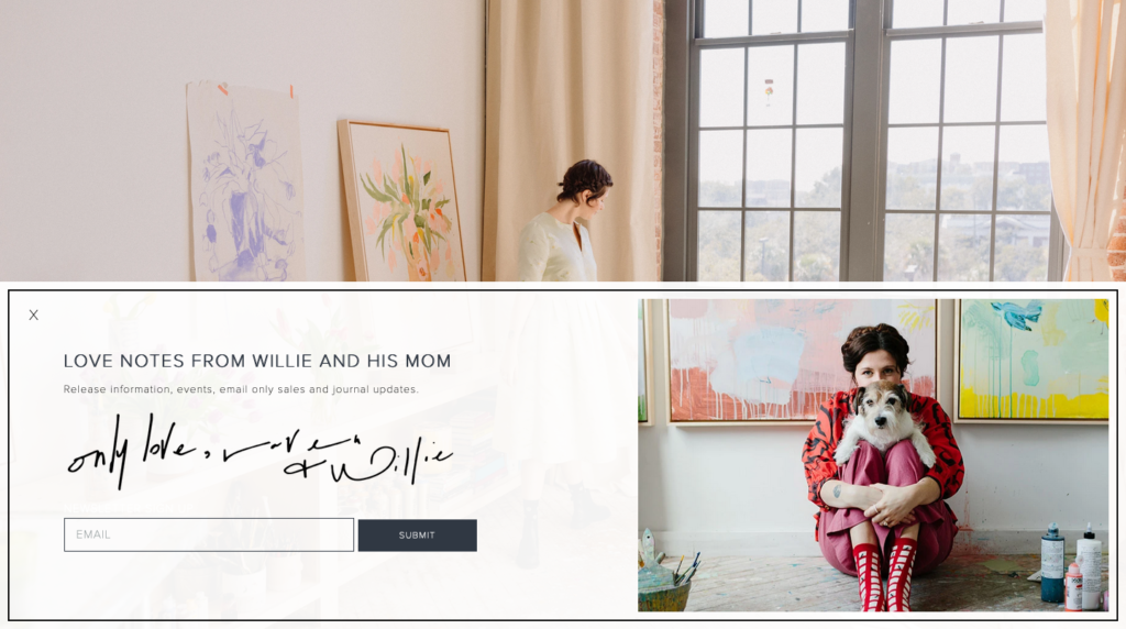
Why we loved it?
- Warm welcoming message from the site owner.
- A real image of the owner and her dog, and the heading welcome the visitor in a cute way.
- Available close button.
#8 Site: https://meowmeowtweet.com/
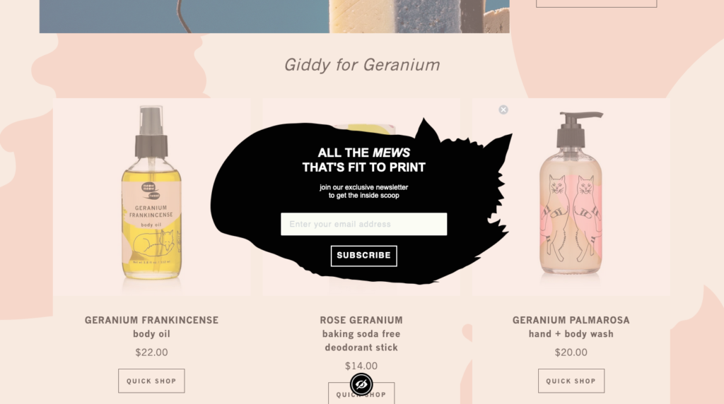
Why we love it?
- Cat icon gives the overall idea of the brand at the first sight.
- Playful heading.
- Available close button.

