Getting traffic but no sales?
You’re not alone.
The most common reason for that is cart abandonment.
Shopping cart abandonment is one of the biggest and frustrating problems online business owners have to deal with. The cart abandonment drastically reduces your expected sales, and it can lead to an unexpected loss to your store as well if no action is taken for the problem.
The average cart abandonment rate for eCommerce is 60-80%. According to Statista, in March 2020, 88.05 percent of online shopping orders were abandoned. And this rate causes online businesses to lose a staggering average of $18 Billion in yearly sales revenue.
Can it get better? Is there any way to reduce abandonments? Abso-effing-lutely! While it’s impossible to wipe out abandonments completely, you can reduce and engage your visitors to reduce the losses.
In this article, I’ll outline the causes behind the abandonments and the solutions to reduce them.
Before going to the reasons and solutions, let’s start from scratch.
What Is Shopping Cart Abandonment?
Abandonment is one of the most persistent problems for eCommerce, with visitors leaving web pages before completing the desired action. Shopping cart abandonment is when your potential customers add items to their online shopping cart, start a checkout process for an online order but drop out of the process before completing the purchase.
Cart abandonment directly impacts the bounce rates which represent the percentage of visitors who enter a site and leave rather than continuing to view or explore other pages within the site.
And, both cart abandonment and bouncing affect conversion rates.
How conversion rates and cart abandonment are calculated?
- To calculate conversion rates, you need to use data from Google Analytics.
Divide the number of visitors reaching your “Thank You” or order confirmation page (Y) by the total number of visitors reaching the checkout page (X) and multiple by 100.
The formula is: Y/X*100
To put simply:
(Thank You page / Visitors reaching your checkout page) * 100
- To calculate the cart abandonment rate, divide the number of the completed purchases by initiated sales. Subtract the number from 1 and multiply by 100.
The formula is:
(1 – (#Completed transactions / #Initiated sales)) * 100
How To Check If You Have A Cart Abandonment Problem
If you have a Shopify-hosted eCommerce store, you can check how many people abandoned your website from the cart page from the built-in Shopify analytics dashboard. For custom, WooCommerce and other eCommerce platforms, you can check the abandonment rate with Google Analytics.
The abandonment rate in Google Analytics is the percentage of people who start a conversion process but don’t complete it.
With Google Analytics, you can check how people behave – use your website and on which shopping stage they exit. Google Analytics allows you to check session durations and bounce rates as well.
Shopping cart abandonment rates are calculated by dividing the total number of completed transactions by the amount of initiated sales. You then subtract that result from one and multiply it with 100 for your final rate.
How to check the number of exits in Google Analytics?
Your customer journey is a crucial part of your business. To take the best possible measures for success, you need data on what’s happening in real-time.
A great place to start analyzing what’s happening in the conversion flow is by looking at how many people are exiting from the basket page. And, we can do so by opening up the Behaviour report from the side panel then clicking All Pages under Site Content. This will open up a table showing us which pages they were viewing before leaving our site with “Pageviews” and “Exit”.
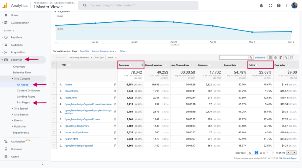
You can filter the pages to narrow down the exit pages report by writing the page names in the search box:
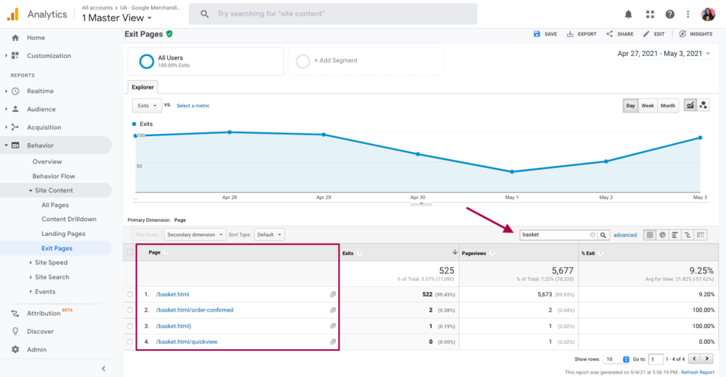
However, this will only display the number of people who exit your website or from certain pages. To see how your traffic is navigating through a conversion funnel and to create reports for cart abandonment, you need to create a custom funnel – Goal.
How to track cart abandonment in Google Analytics with a goal?
Set up a new goal.
- Go to the Admin page.
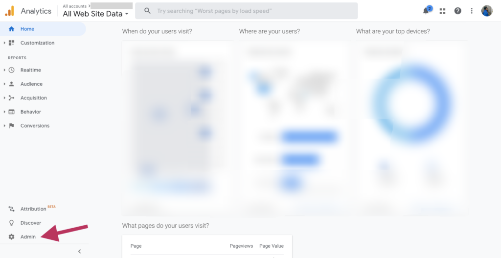
2. Once you select the Property and View, then click on the Goals.
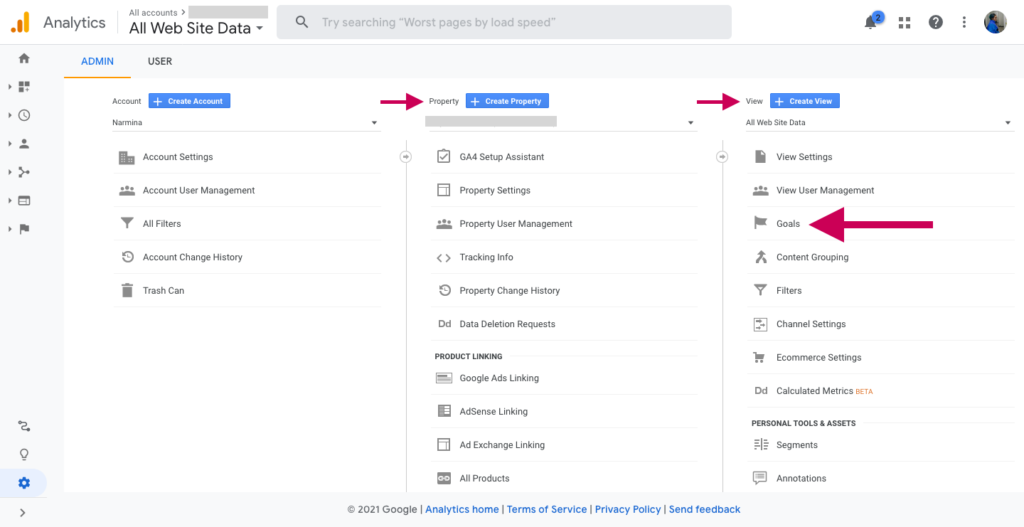
3. Click on the New Goal button.
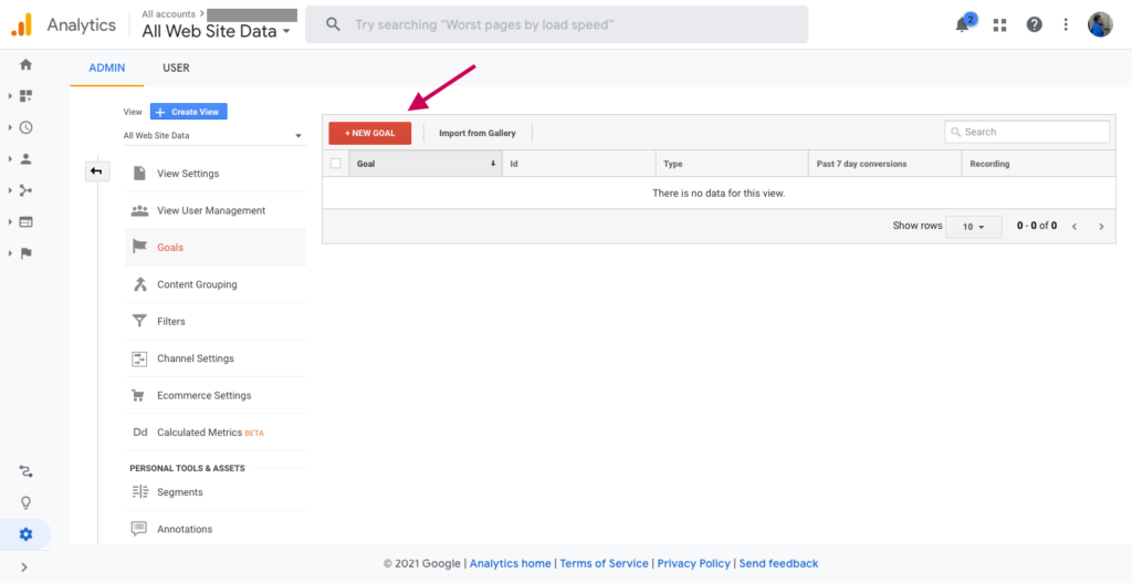
4. On the opened page, choose one Goal Objective. For tracking cart abandonment rate, select Checkout Complete option from the template section, and click Continue.
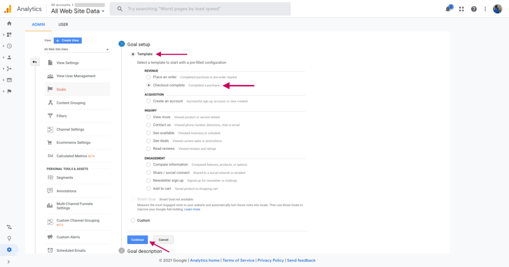
By choosing the destination type, you determine what you want to measure. The destination is the expected final stage of user behavior.
5. Here, you select Destination and click the Continue button:
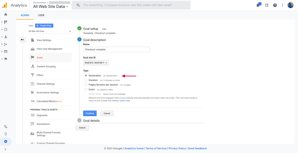
6. For the cart abandonment rate, choose the order success page for the final destination. Also, select the “Equals to” option and paste the page URL of the page shown after the checkout is completed. In the example below, the page that appears after the order is completed, is “Thank You” page.
And, if your store sells single products, then turn on the Value toggle and add the value of each order. If you have multiple products and each of them has different values, then keep the toggle off.
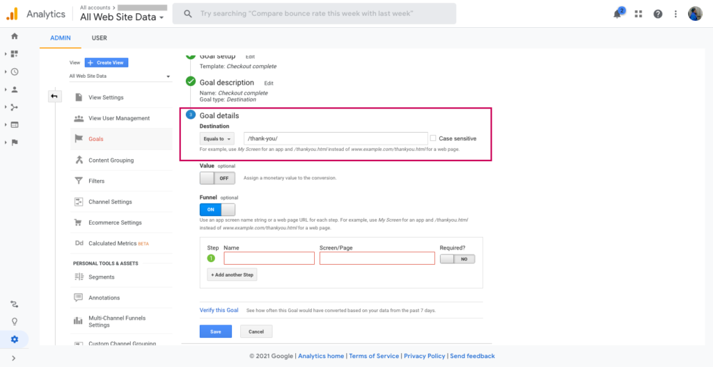
7. Also, enable the Funnel toggle to track which stage the people dropped off your site – exit your store. Goal or conversion funnel is simply a sequence of action steps that your leads must go through in order to convert. On Google Analytics, each step of a goal funnel represents a step on your website that must be completed to achieve a Google Analytics Goal.
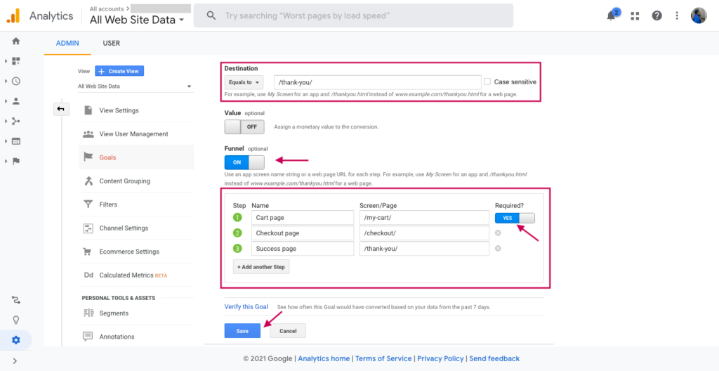
8. Enable the required toggle on if the included screen must be taken to achieve the goal. In this “Steps” section, add the page titles and URLs those that someone must view that page at some point before viewing the conversion page.
9. After you’ve filled the fields, click Save.
Now you’ve set the conversion goal.
Find the conversion report.
- Go back to the Home page.
- Here, select the Funnel Visualization from the Conversions -> Goals menu.
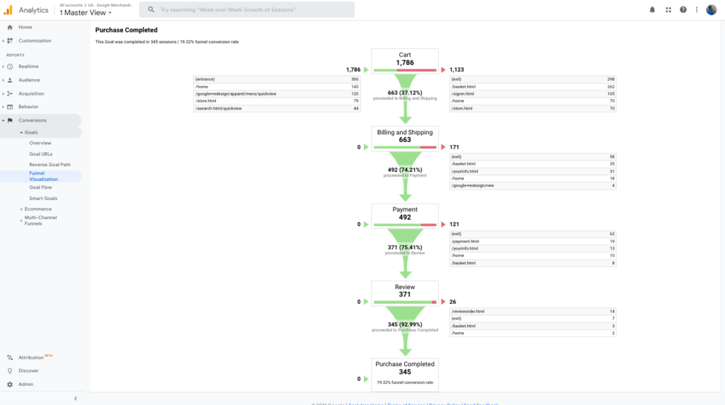
The Funnel Visualization report is an excellent way to assess website performance. You can use this tool to take a step beyond looking at the total conversions and overall conversion rate as part of your analysis.
Here, each stage of the shopping is visualized: you can see the number and percentage of users dropped in each funnel step.
When setting up a conversion to track, remember all the funnel steps you need to measure in this process.
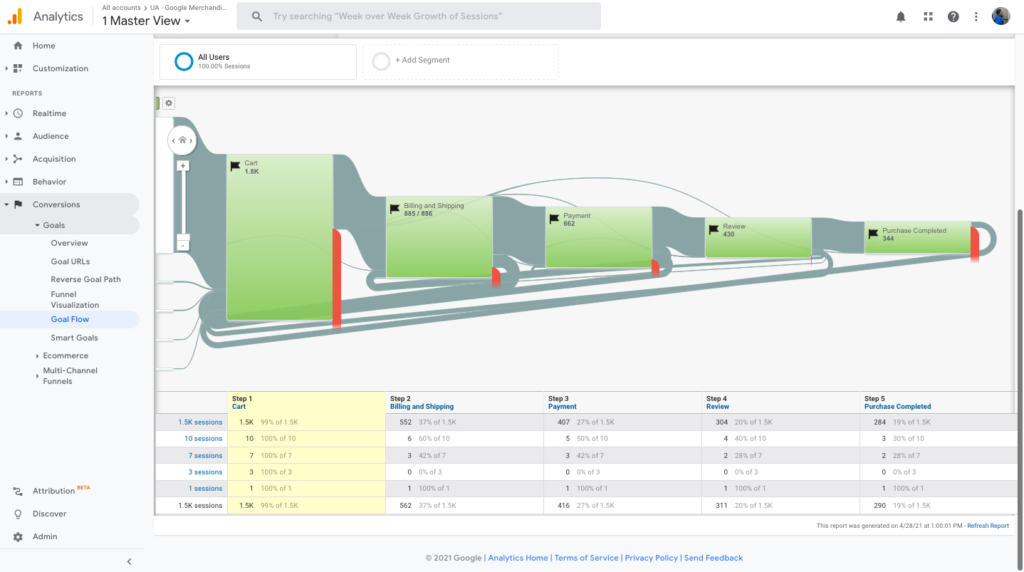
The Goal Flow report in Google Analytics can show you how your traffic is navigating through a funnel towards conversion. This report can help you see if users follow the path or encounter problems, such as high drop-off rates and unexpected loops.
To see the Goal Flow report, select the Goal Flow from the Conversions -> Goals menu.
The Goal Flow report is a flexible and useful reporting system that allows for historical data analysis, advanced segmentation, and funnel analysis without backfilling. The Funnel Visualization Report, on the other hand, maybe good if you’re looking at what steps people are taking, but it doesn’t account for an accurate representation of actual events or situations because it backs up to fill in missed information.
Why Does Cart Abandonment Happen And How To Solve it?
By identifying what causes shoppers to abandon their cart, you can reflect on the reasons and reduce the abandonment rate.
Abandoning a shopping cart can be as simple as forgetting. But it’s not the whole scenario.
When you think that nearly 70% of your customers will abandon their cart, it’s unsettling: that shows how much work eCommerce store owners have on their plates.
According to Baymard, the main reasons for visitors to abandon the cart are:
- 53% – hidden, added up costs that show up in the checkout
- 31% – required account creation
- 23% – complicated checkout process
- 17% – security and trust issues
Added up costs are the number one reason for cart abandonment
53% of the online consumers will drop the checkout process if the total cost is higher than expected. Most consumers expect to see all costs in total associated with a product before they come to checkout.
Shipping costs showing up in the checkout process is a number one irritating reason among the unexpected costs. Most online stores calculate and display shipping costs at the checkout page once consumers include billing information.
Other hidden extra costs include taxes and complimentary items that are required for product use.
Hidden costs may make consumers feel remorse for buying products.
Be transparent with extra costs throughout the shopping process
This will help visitors feel more comfortable and complete their purchase quickly without worrying about hidden costs popping up at the last second!
People are more likely to abandon basket if creating an account is required
Mandatory account registration can frustrate customers; thus, they may drop out of the checkout process. The reason is that consumers want more convenient shopping experiences, and forcing first-time consumers to create an account creates the opposite results.
22% of people abandon their cart if it’s required to create a new user account, and 28% of consumers say that mandatory account creation is the reason for abandonment.
Creating an account seems like a redundant process if a user plans to purchase only once.
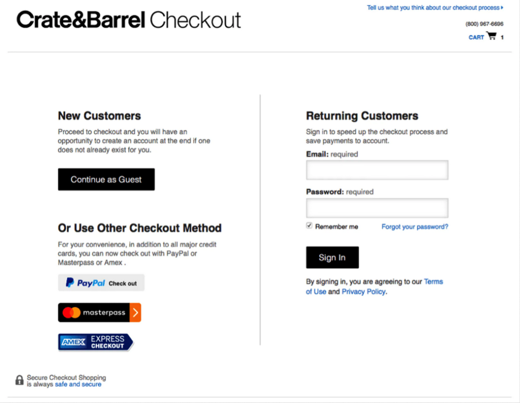
Offer guest checkout for new customers and have a seamless customer experience
Self-contained, easy, and fast checkout pages give a better customer experience and increase conversions. With one-page checkout, online consumers can conveniently purchase without having to go through the hassle of creating an account.
Consumers will leave checkout uncompleted if the process is long and complicated
The checkout process should be simple and easy to understand. If the process is long, complicated, or there are too many steps in between, your customers will leave without completing their purchase. In the recent study of the Baymard, the checkout process becomes overwhelming due to the high number of form fields. Even optional selections can cause friction and frustration for users, slowing them down in their shopping spree.
As the mandatory account creation, long and complex checkout processes and a lack of information about how to run the checkout process bounce your potential customers back.
Simplify the checkout flows and steps
If you optimize the checkout process, your conversions will rise up to 35.62 percent.
Baymard Checkout Usability study reveals that 5- and 6-step checkout flows are the two most common lengths for checkouts.
“The average checkout flow contains 23.48 form elements and 14.88 form fields (when purchasing as a new non-account customer). Yet a fully optimized checkout flow can be as short as 7 form fields, with a total of just 12 form elements.”
To reduce the number of form fields, you can use the following techniques:
- Collapsing the “Address Line 2” and “Company Name” fields behind a text link
- Using a single “full name” field instead of first, middle and last name
- Setting default billing same as a shipping address
Also, consider adding a progress indicator. Let customers know how far along in the shopping experience they’ve progressed by adding breadcrumbs like steps. This allows customers to know where they are in their purchase journey. Breadcrumbs are the little labels that show shoppers how many steps they have left to finish their purchase.

Displaying a progress bar also helps ensure a shopper does not miss any important steps along the way and ensures there’s no confusion or frustration, leading them to leave the checkout.
You can also include a thumbnail of the product purchased until the very end of the checkout and let your customers see their items on the screen along with details like size, color, and quantity.
Or, make navigation super easy and minimize the number of clicks and pageviews so that your customers will go back to check the product or price within clicks.
Lack of trust also triggers people to leave the checkout uncompleted
Oftentimes, when consumers are not feeling secure in a transaction, they will be reluctant to complete it. For example, suppose there is a concern for payment security or lack of trust from the company; in that case, this can cause hesitation and make them change their minds about completing the purchase altogether.
Use Social Proof to reassure customers that they are making the right choice
Adding Social Proof to the cart page will allow visitors to complete the purchase without losing time searching for the brand trust that keeps them from going to the checkout process.
Types of social proof you can use on the cart page are:
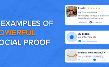
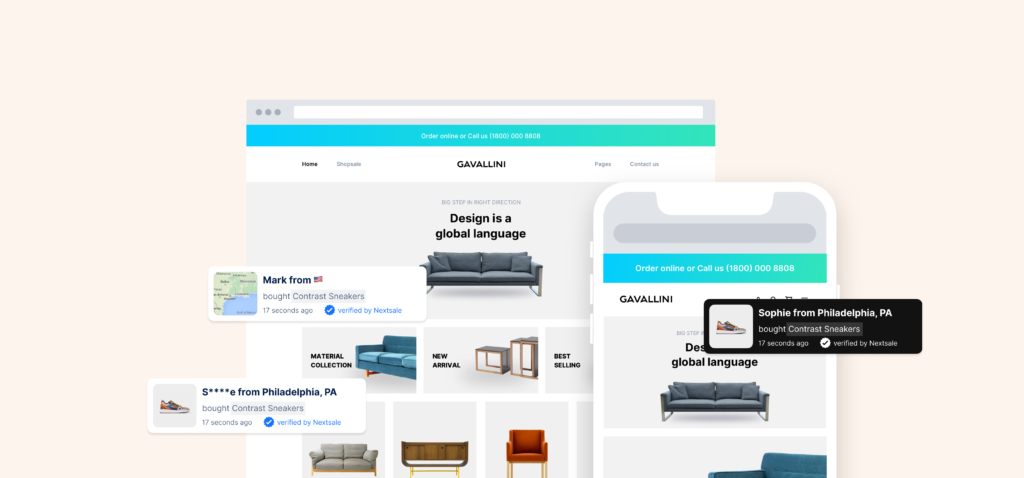
- Sales notifications
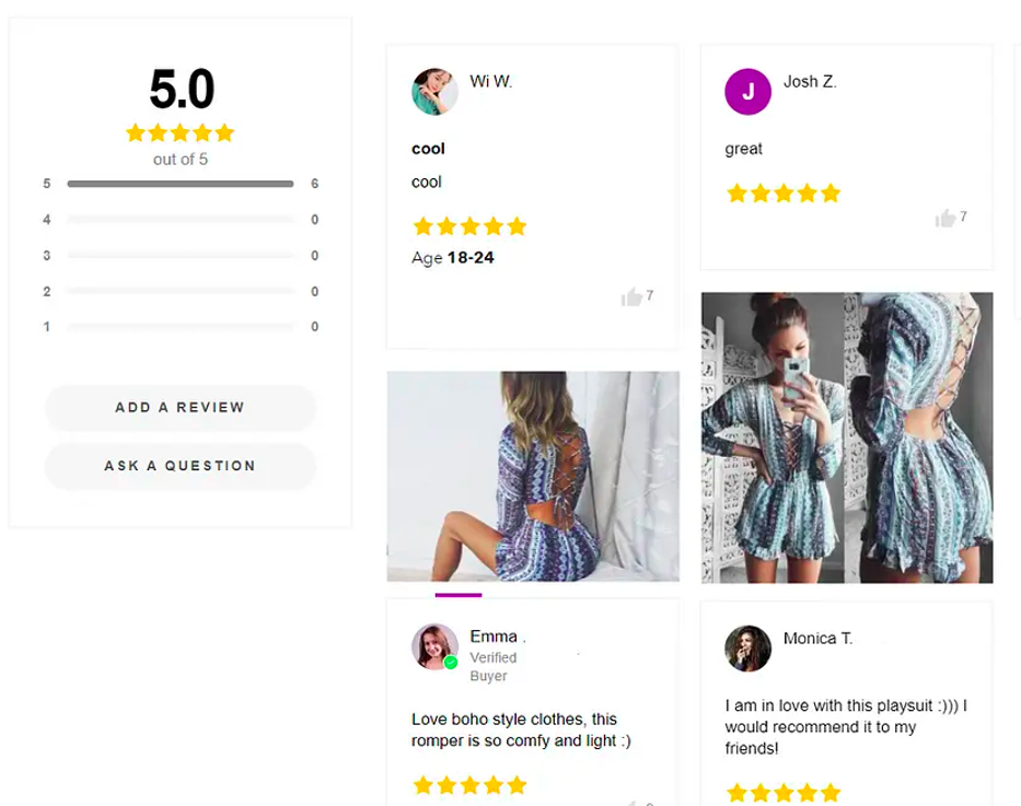
- Reviews & testimonials
Sales notifications
Did you know that when people see someone who is similar to them make an in-store purchase, they are more likely to buy something too? If people see another person who fits their demographic profile, then they are more likely to buy similar products.
For many people, seeing other shoppers making purchases related to what they’re looking for reinforces their decision-making process just because social validation and conformity kick into high gear for similar products.
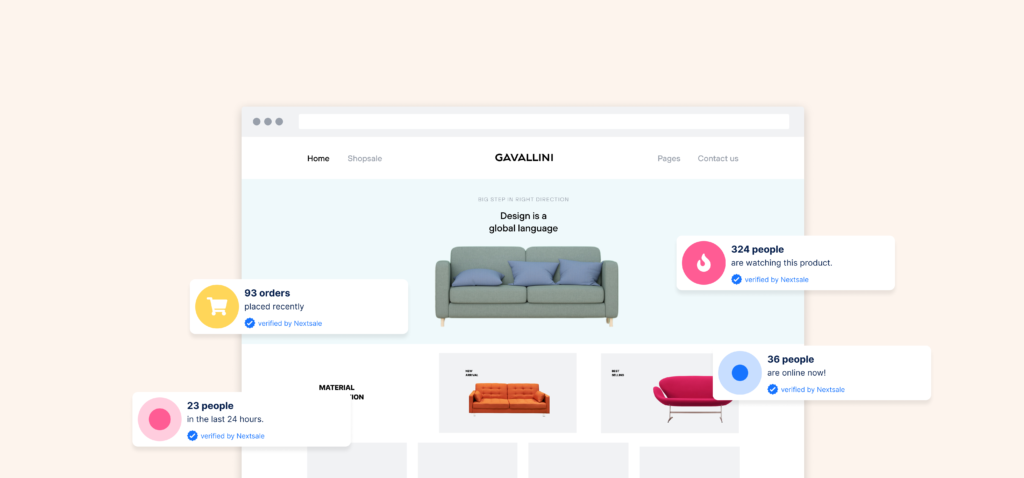
By displaying social proof notifications, you let your visitors know that other people are also buying products from your store.
Reviews and testimonials
An overwhelming majority of consumers, 97%, cited online reviews as a major influence in their purchase decisions.
With Shopify apps like Nextsale and Growave, you can display reviews and ratings as social proof notifications to win the trust of your customers.
Site speed and lazy load checkout page results in high cart abandonment
If your website is slow in the first few moments they interact with it; then you’re losing more than half of them. According to a study, after only three seconds, 57% of online consumers will abandon a site, and 80% of those consumers will never return.
For online shoppers, every second matters: One second of delay can lead to a 7% drop in conversions and 11% loss of page views, and 16% in customer satisfaction.
Improve site speed to deliver a smooth shopping experience
According to a shopping behavior analysis by Kissmetrics, 47% of consumers expect a webpage to load in 2 seconds or less.
To speed up page load time, consider the followings:
- Run a site speed diagnosis
- Minify CSS, HTML, and JavaScript
- Delete unused plugins and themes
- Optimize images by reducing the size and changing the format
Also, use tools like Google Lighthouse to measure the quality of your web pages and GTmetrix to see how your site performs, monitor why it’s slow, and discover the solutions.
Lack of support in the middle of online checkout results in a higher cart abandonment rate
Your customers may have questions holding them back from buying, like additional information on your product features, shipping methods, or detailed payment information.
Missing delivery and return policy will also make customers hesitant to complete a purchase. This also includes if the checkout process is complicated and there is not enough information about how to run the payment procedures, shoppers have no choice but to leave.
A Forrester report says that “44% of consumers think that having questions answered by a live person while in the middle of an online purchase is one of the most important features a website can offer.”
Add live chat to the cart page to ease the checkout process
Customers want to get a quick answer to their questions and a fast solution to their problems. Options like click-to-call and live chat are a great way to keep talking to customers through the buying process.
Live chats are one of the ideal customer service tools to provide the quickest communication for eCommerce businesses.
Live chat, or pop-up chat windows can help visitors with immediate assistance from the help desk. If a customer is stuck on a certain page for a long time, pop-up chats can ease their doubts about all the ways of the checkout process.
Poor mobile shopping experience triggers consumers to leave checkout uncompleted
Over 50% of online shopping now happens on a mobile device.
Customers are more likely to exit without checking out when the mobile experience is not as good as desktop. Overlay of widgets, form popups, constant zooming in keeps users frustrated.
Brilliance says that the smaller the size of the screen, the more likely a customer will not purchase. This shows itself in the higher abandonment rate of 85.65 percent for mobile users.
Optimize your store for mobile shopping
Automatically displaying the numerical keyboard, selecting default billing the same as a shipping address, using an easy-to-tap full-width text row to make the text easier to input are the common practices to optimize checkout for mobile.
More Tips To Fasten The Checkout Process
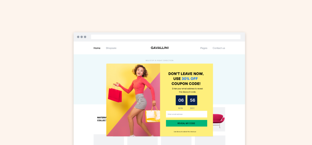
Display promo popups that highlight discounts if there is no available free shipping
Shipping fee showing up on the checkout page is one reason customers will leave the checkout page. If there’s no available free shipping, offer discounts with promo popups.
You can also add a cart timer to the popup to show that the discount will expire soon. This will create an urgency to speed up the checkout.
Show on-site messages when visitors are about to leave
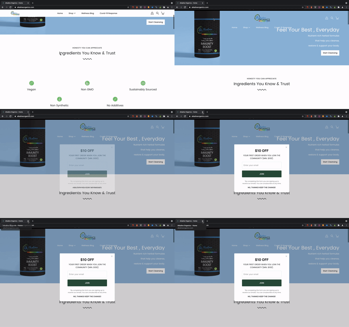
Showing a promo popup is the last change on trying to convert that customer in the last seconds.
Exit-intent is one of the most powerful campaign triggers.
On-exit intent technology triggers widgets to appear when a user’s cursor moves out of the upper page boundary; it’s done by tracking mouse movements. The on-exit technique is used to retain visitors from abandoning a website by offering special discounts as the visitor is about to leave your site.
Let your customers know how busy your store is
By displaying the website dynamics, you remind the customers of other customers’ existence.
“Brooks was here. So was Red.”
Activity notifications are one type of social proof notifications that let your customers know how many visitors are watching a certain product or how many are or were recently live.
Add trust badges to the checkout page
Trust badges play as an element of certificated social proof.
A trust badge is a seal or badge that is placed on a website to build trust in your potential customers. Trust badges usually indicate third-party service providers such as partners or secure payment systems and SSL certificates.

Traditionally, trust badges have been visible on the checkout pages to overcome the skepticism about the security of payment methods such as Stripe, or PayPal. These are called accepted payment badges. Accepted payment badges let the website visitors know that your webpage is legitimate and the third-party service providers secure the data they share.
Highlight your return and refund policy
Sometimes people need to know the ins and outs of an order in advance and want some reassurance before making their decision. Adding frequently asked questions (FAQs) indicates how easy it will be for both parties to go through a return or refund process. More info about after-the-purchase scenarios is one way to ensure customers know no unpleasant surprises later on and feel confident when buying from you.
Wrap up
There are more ways than ever to shop online. With so many options, it’s not surprising that consumers often have difficulty deciding which site they want to purchase from and abandon their cart before buying anything at all. By making the shopping experience smooth and simple and gaining the trust of customers is key to win the hearts and minds of customers and motivate them to continue buying from your brand.
To reduce or even eliminate cart abandonment rates, try some of these strategies. Have you tried any? What has been most effective for you? We’d love to hear about how this advice worked out in other customer’s experiences!


