Popups “are annoying,” “they make visitors leave sites immediately,” “they ruin the user experience.”
These are common perceptions towards popups, Optinmonster says.
Using popups is one of the feelings that feel like crime but in reality, isn’t.
They can be annoying, and users may HATE them. It doesn’t mean they are not effective, and you shouldn’t use them in your eCommerce sites.
If popups are getting all these annoyances and hate, how do they still increase conversions? And if it’s the case, why do retailers still use them?
Although we can’t ignore the fact that popups may annoy people, there are some tricks to optimize them and create exceptional shopping experiences. Some cases show that site popups increase conversions by up to 40% (ActiveCampaign). And, an average conversion rate of popups is 3%, which gives merchants quite a good reason to use.
So, lets first see why popups annoy sites’ visitors, and then, how to create high converting popup campaigns.

Why are popups annoying?
Popups frustrate Internet users because they:
- cause distraction
- show unrelated content – mostly ads
- pop up too frequently
Above mentioned points are the common reasons that make on-site popups annoying. Let’s go over one by one and see why.
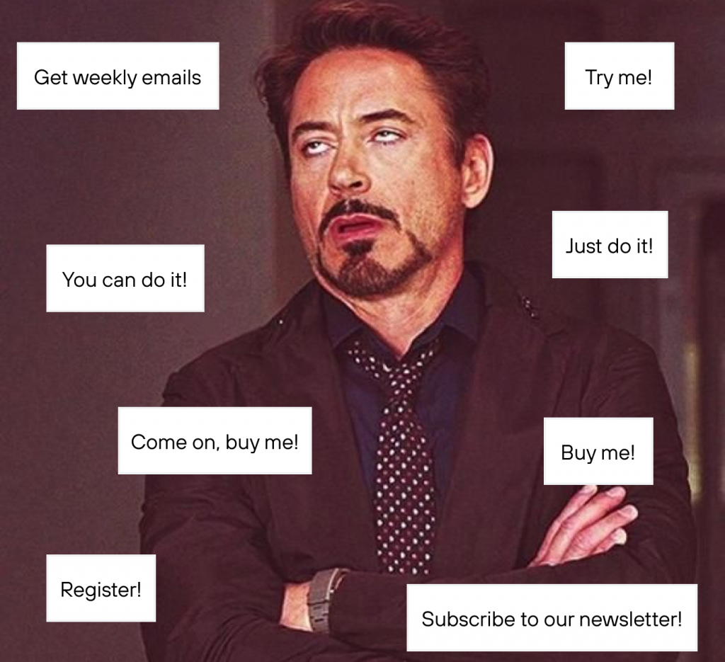
Popups are distracting
Popups interrupt site experience. Imagine you head to a webpage from Google to read an article or check something out. You have just launched – suddenly, a full-screen popup appears. Without seeing the content, you are offered something you have no idea about yet.
Or when you search an article and visit a webpage thinking this can be perfect for reading – and TADA! – One big popup covers all the screen, and there is no close button.
Sometimes you can close, sometimes not, or find it hard to close the popup. These kinds of popups break user experience.
Popups show irrelevant content – mostly ads.
On-screen popups are different from on-site popups. On-screen popups are mostly spammy and launched to your computer by third party applications – and they are malware, adware, and spyware popups that contain viruses. Actually, Ethan Zuckerman, the man who invented popup ads, apologized for creating the most hated advertising tool forms on the web. But still, we have them.
Most of the Internet users are fed up with fake ads and unrelated content. 74% of consumers get frustrated with websites when content (e.g., offers, ads, promotions) appears that has nothing to do with their interests (yahoo!finance).
Imagine you are surfing on educational content, and a popup appears and offers you to buy shoes. If the popup were something related, i.e., e-book, it wouldn’t frustrate a visitor.
Popups appear too frequently
That is one of the biggest mistakes site moderators/administrators make. They lower time delays between popups, so even if a user closes the first popup, the next ones pop up right away. Even if you offer discounts and valuable content, and display it with short delays, bad news – you lost the game.

Another mistake is that administrators launch popup campaigns on every page. The trick is to display the popup on the right page, to the right customer, and at the right time.
How to optimize popups for the best results?
Simply, we need to know which type of popups to use, in what context, and at what time.
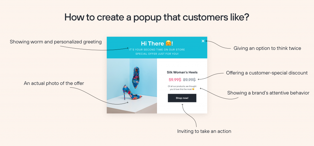
If you optimize your popup campaigns right, you don’t annoy them and create perfect user shopping experiences.
Quick fact: there are two types of on-site popups:
- The ones that Google recognizes them spammy and does not allow
- And the other one that integrates smoothly with your website
So, if you are looking for software to create popups, beware of their speed, and integration with your website. A good popup app should not slow down a page’s speed or affect website performance.
Here is the shortlist to use popups correctly:
- Extend time delays
- Create visitor segments
- Make close button available and make popups smaller (save margins space more)
- Offer something valuable
- Personalize
Extend time delays
Timing, timing, timing – you need to be careful with it.
Don’t show popups immediately. Backed by in-depth research, Nextsale recommends perfect timing for the initial delay of a minimum of 7 seconds.
This delay allows your visitors to see your site content first and get to know the products.
Think it over. When you walk into a store, a salesperson approaches you right away and offers to try their product. Or, as you walk around in a store, a salesperson follows you and offers a product in every minute. Wouldn’t you get annoyed?
Let your visitors take a breath – first get to see your content and engage with your website. After a certain time, you are free to display a popup and offer a discount to motivate them to take action.
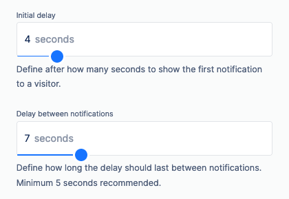
On-scroll and on-exit intent popups are perfect choices to engage your visitors without annoyance.
On-scroll-intent popups allow you to extend the time delays: you can show on-site widgets after visitors scrolled a certain percentage of a page. By doing this, you let them have an insight into your page.
Likewise, on-exit intent popups appear when a visitor is about to leave a page – hovers a mouse to the exit button. Exit-intent popups reduce cart and page abandonments and allow the visitors to think twice.
The trick is you need to add flavor (adding value and uniqueness) when creating the exit-intent popups so that visitors can resist your offers.
Make popups smaller
Little popups never hurt nobody.
Don’t create obstructive popups. If we consider that mobile usage has increased hugely and you need to optimize your mobile site, popups should be smaller than the screen. And as Google recommends, make banners, so your site content isn’t hidden for the visitors.
Take this into consideration, 1.2 billion people worldwide access the internet from their smartphones (Mobify).
It’s perfect to use either mobile responsive popups or just sticky banners to save margins.
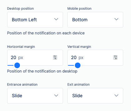
Make close button available
Make the close button available. It would help if you showed the visitors that they have an option to close the popup – so you give them freedom of choice.
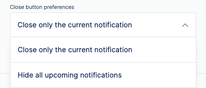
Also, a discouraging “no” option makes visitors think twice (Semrush). When you have a close button, visitors are more likely to accept your offers and take action.
You can make the close button whether visible on a hover or a sticky button.
Show and offer something valuable
Don’t expect the consumers to fall for your offers for nothing. If you interrupt their experience, then you need to offer something valuable to justify yourself.
Offer something distinctive and limited that you give only to certain groups of people. For example, say that you send your e-book only by email.
Offer discounts to motivate your visitors to take action. For instance, if you want to generate leads – capture phone numbers or email addresses, give discounts in return for their subscriptions.
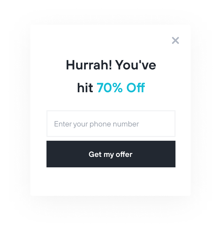
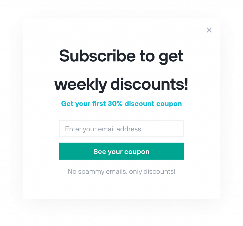
From our customers’ experience, here is the anatomy of exit-intent popup that converts 30% better than other solutions:
- Popup indicates that they will not bother you with daily emails – only once in a week;
- Then comes an offer – and emphasizing that it’s the first one and the others will come;
- At the bottom, they clarify that there’ll be no spam emails;
- And of course, a close button.
If you don’t offer something valuable and unique, you’re doing nothing other than a distraction.
You can offer:
- Free stuff: e-book, or any material that is valuable to you and your customers’ interests
- Discounts & coupons: you can play around and be creative to offer percentage discounts, total offs, or weekly or monthly discounts.
- Special offers: these are exclusive offers and delivered only by emails and phone numbers.
Also, try not to ask ask too much information about visitors on the popups. Keep your requirements simple and limited with 1 or 2 input boxes. Remember that keeping required information short means that you value your visitors’ time.
Show the related content to the right visitor
74% of customers feel frustrated when website content is not personalized (Instapage).
Don’t show unrelated content. I’ve faced this many times: I was looking for buying pasta, and one sales representative offered me to buy hair shampoo. Just because the shampoo is at a discount price doesn’t mean I would be interested in it. Same with online stores.
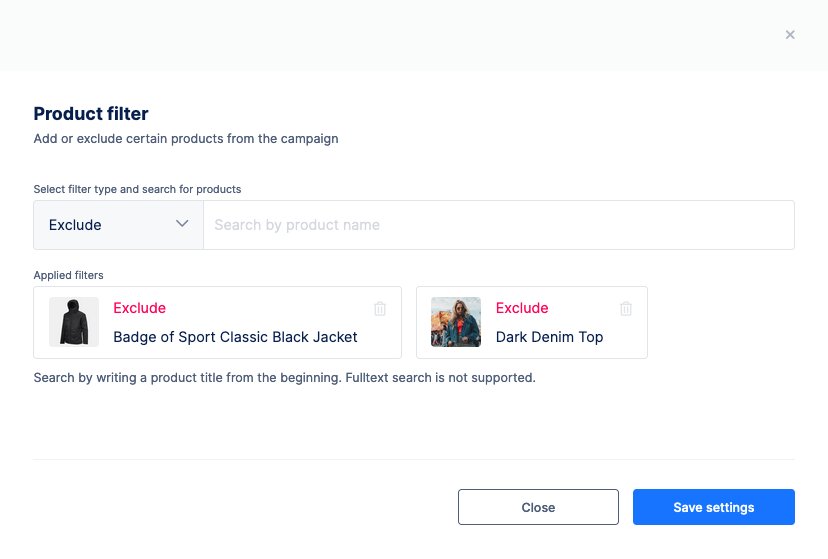
If your eCommerce store sells multiple products from different categories, you better match the notifications – popups with their respective product pages. Show your offers if they are related to the pages.
Personalize your popups with segments
91% of consumers are more likely to shop with brands who recognize, remember, and provide relevant offers and recommendations (Accenture).
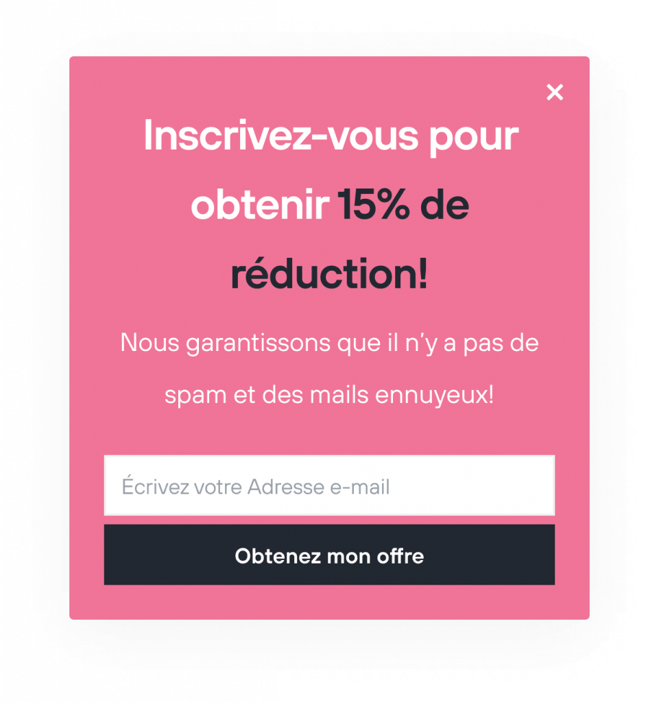
Show personalized content to indicate that your offers are unique and special for the specific audience. To personalize your popups, you need to create visitor or customer segments to target them right.
For instance, this popup below is targeted to the French-speaking segment of customers.
How to know if your popups convert?
Knowing all these mistakes and solutions, how to know if your popups are effective and doing good? Here is the checklist:
- Look at conversion rates when you use popups on your website. Do they convert? Do they generate leads? If yes, you are on the right path!
- Check bounce rates on Google Analytics. Your visitors should spend a good amount of time on your site. If your offers on popups are designed to let visitors explore more, they should spend more time on your site.
- You may also need to check your visitors’ behavior and see how they act on your popups with tracking visitors by Hotjar or Yandex.Metrica.
Also, remember that a good popup:
- Increases conversions
- Doesn’t disturb the visitors
- Shows valuable content
- Doesn’t appear too frequently to a particular visitor
- Increases visitors’ time spent on your site
- Appears to the specific segments of visitors
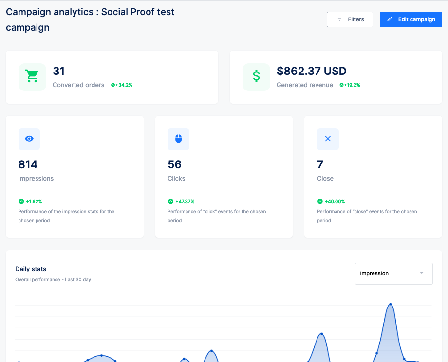
Nextsale offers you a campaign analytics tool to track the impressions and conversions. You can view:
- Most converting pages
- Most converting countries
- Generated impressions and sales
You can also set goals and track the performance of your campaigns.
Popups can help you to know which products your consumers & visitors are interested in. That is perfect for retargeting and remarketing. It’s a must for every eCommerce website.
So, should we use popups in eCommerce?
In conclusion, using popups is risky, but the reward outweighs the risk. Check out the quick list below to avoid, and use the tricks while designing your on-site messages.
Avoid:
- Unrelated offers and content
- Showing popups right after visitors lunch on your site or displaying too late
- Requesting too much information
- Giving no chance to close popups
Use:
- Personalized messages
- Unique content – deliver value
- Visitor specific – personalized content
Simply, just keep in mind that when creating popups should be delivering value while minimizing the frustration.
P.S.: Nextsale allows personalizing your on-site messages, especially for the segmented group of visitors, and using the segments for retargeting and remarketing purposes.


